Work / Digital experience
← All workDigital Invitation
An invitation that brings together schedules, venues and attendance responses, with a dashboard to organize replies and follow up with guests.
Frontend implementation · Visual adaptation · Interaction · Responsive experience

01 / Context
An invitation can do more than share a date.
Guests need to know where to go, when each occasion takes place and how to confirm attendance. The project brings this information together in one link, with a presentation tailored to the celebration. The same foundation can be adapted for graduations, weddings and other events with schedules and attendance responses.
Emotion + information + usability
02 / The experience
From paper to action.
Guests open the envelope, discover the celebration, browse its events and reply without leaving the invitation. After submitting, they see a summary of their response and can continue to gifts. For organizers, the dashboard brings together guest lookup, editing and follow-up.
- Open
- Discover
- Browse
- Respond
- Review
- Follow up
03 / Opening
The first interaction is an envelope.
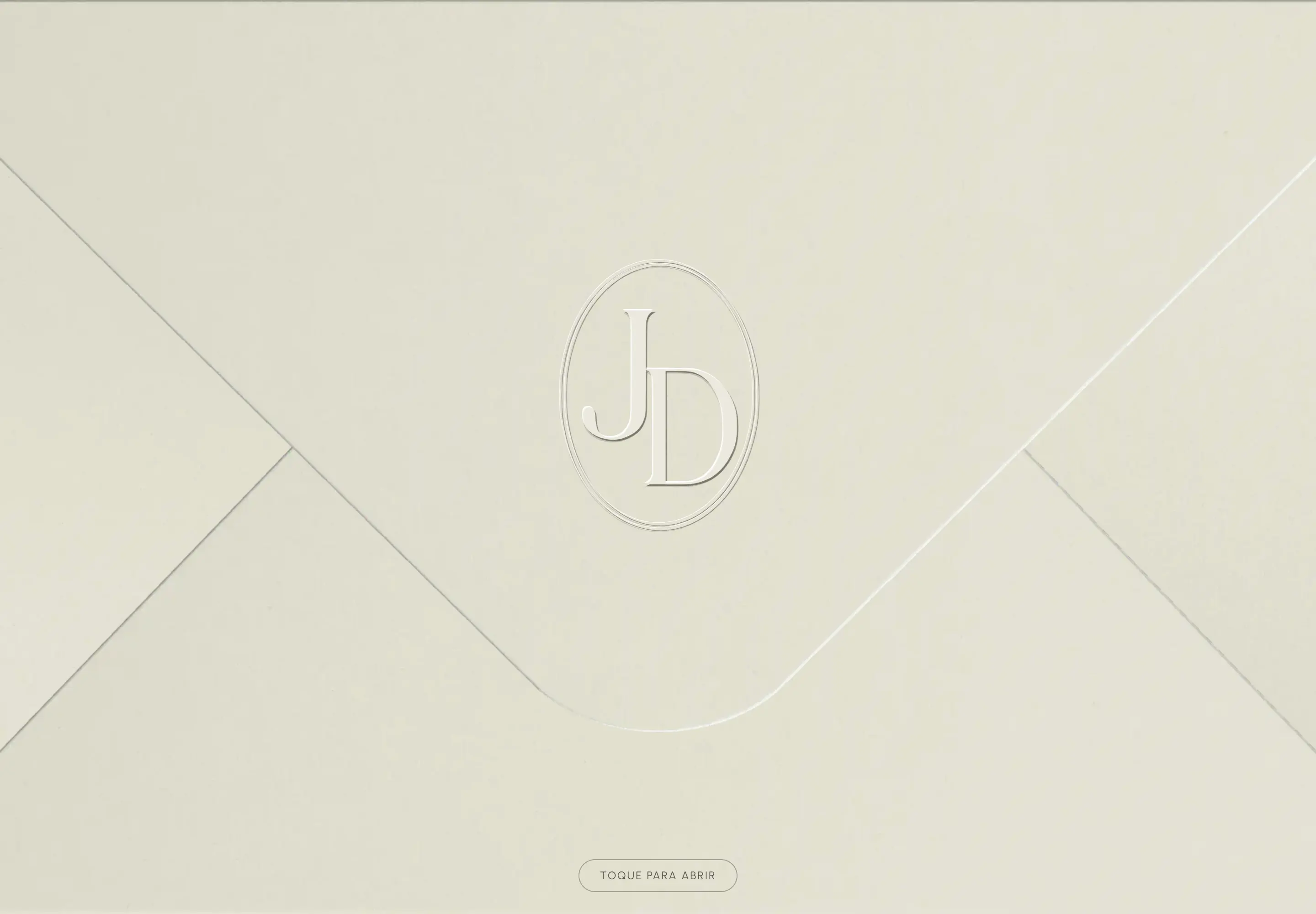
Full-screen paper, folds and a JD monogram bring the language of a physical invitation to the screen. A tap opens the flap and reveals the hero; the Escape shortcut gives direct access to the content. With reduced-motion preferences, the transition is immediate. The implementation uses CSS and browser APIs.
- Envelope
- Hero
- Content
Desktop interface / swipe to inspect
04 / Visual system
Materiality and hierarchy.
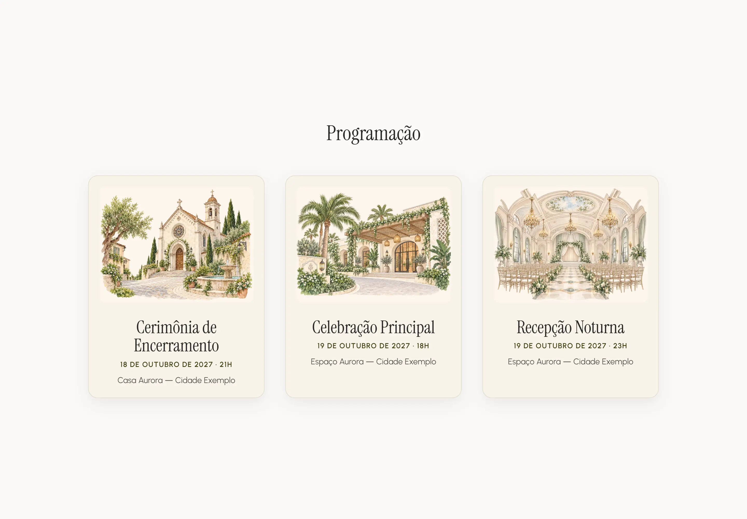
Light surfaces and paper tones connect the interface to the invitation. Dark text, open space and the contrast between expressive headings and functional copy guide reading. The schedule’s illustrations have a watercolor treatment; the dark RSVP section marks the shift from presentation to action.
Paper and texture
Folds, embossing and a monogram give the opening a distinct moment.
Type with a purpose
Expressive headings sit alongside quieter labels and practical information.
Adaptation and refinement of an existing visual base. The photographs are AI-generated; illustrations and fonts are not attributed to Bruno.
05 / Event information
The same information. A different way to navigate.
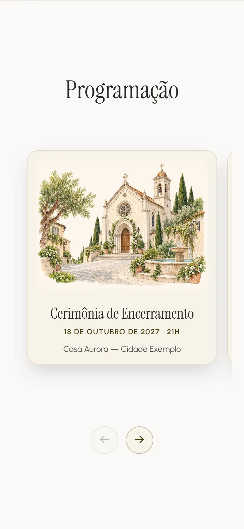
On desktop, three events appear together in chronological order. On a phone, the cards become a horizontal sequence navigated by touch or buttons. Dates, times and venues retain their hierarchy as the composition adapts to its context.
Desktop interface / swipe to inspect
Open the address on a map or download the events to add to your calendar.
06 / RSVP
From browsing to responding.
Guests enter their name and WhatsApp number, indicate attendance or absence and choose which events to attend. Email and notes are optional. Guidance beside the fields helps correct details, and the button indicates submission progress. Responses are organized for lookup and follow-up in the dashboard.
- Enter details
- Choose attendance
- Select events
- Submit
- Review response

07 / After submitting
Your response. The next step.
After submitting, guests receive visual confirmation with their name, attendance and selected events. Guests who cannot attend also receive a thank-you message. The summary lets them review their response, and the gifts button offers a clear next action.

08 / Responsive design
Designed to arrive as a link.
A phone is a natural place to browse a shared invitation. The experience adapts the hero to portrait orientation, stacks the form, offers touch navigation for cards and opens photographs in a lightbox. Framing, order and navigation respond to the available screen.
Actual Chromium captures: 1440 × 1000 and 390 × 844 CSS pixels. The supplied audit does not include comprehensive testing on physical iOS/Android devices or with assistive technologies.
09 / Event organization
Every response. An overview of the event.
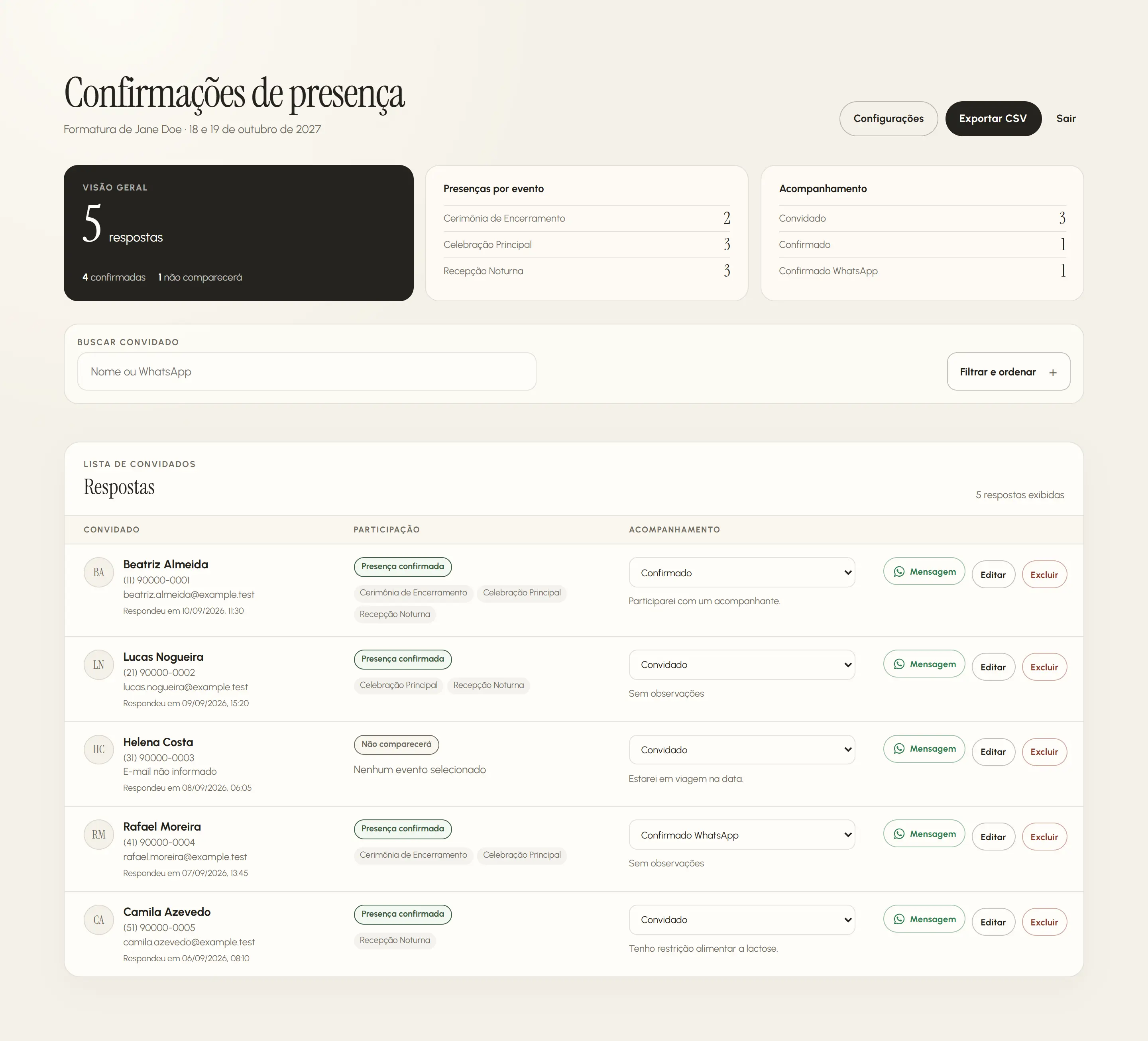
Organizers view attendance totals, see participation by event and follow up with each guest. Search by name or WhatsApp number, filters and sorting help find responses. They can correct details, delete records after confirmation and update follow-up status.
Desktop interface / swipe to inspect
10 / Guest contact
From a response to a conversation.
From the dashboard, organizers open a guest’s WhatsApp conversation with a prepared message. The default text can be customized and includes the guest’s first name. Lookup and contact stay close together: the response already contains the details, without searching another list for phone numbers.
Desktop interface / swipe to inspect
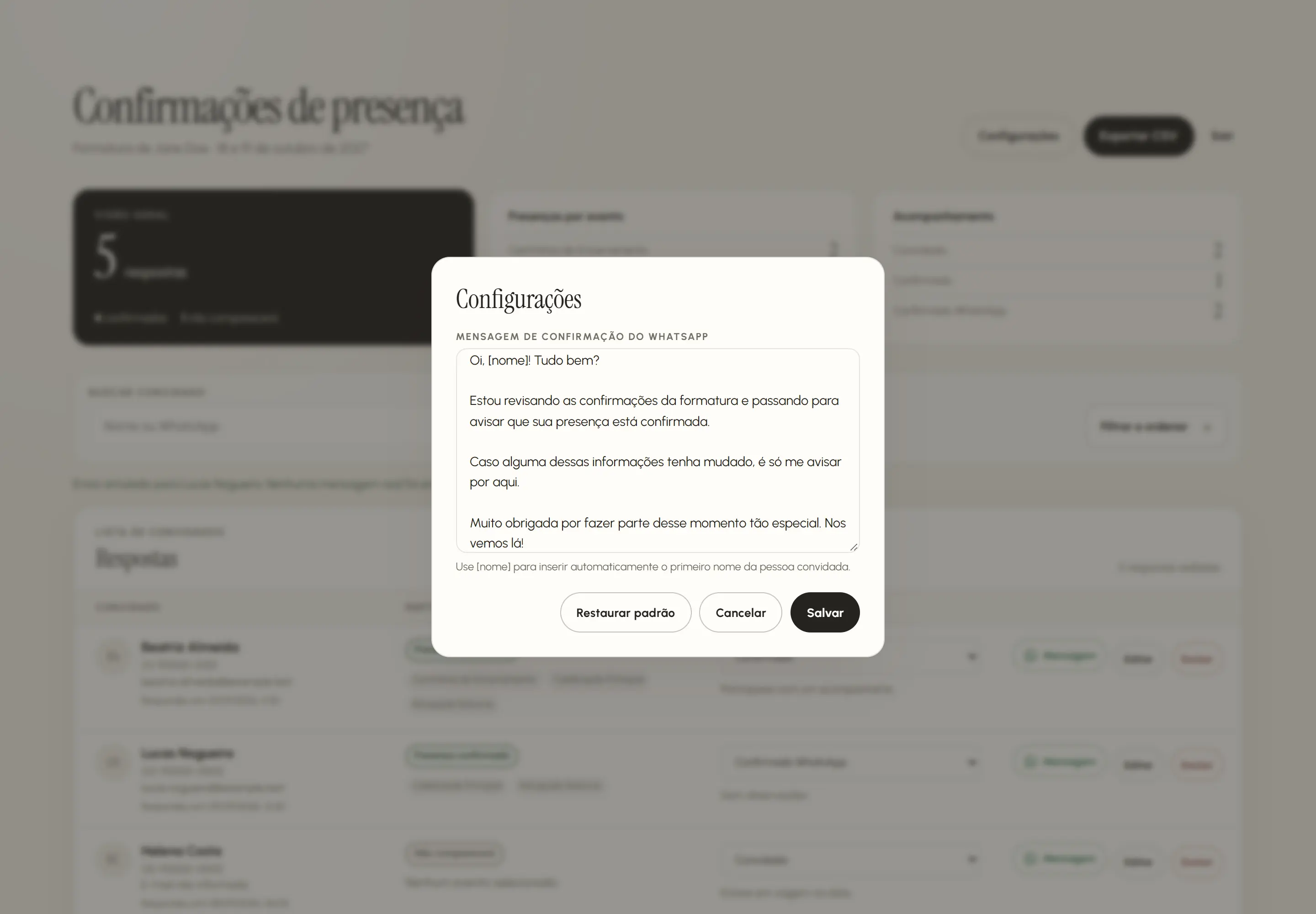
The organizer completes sending in WhatsApp; opening the link does not confirm delivery or reading.
11 / What the project solves
One invitation. A complete experience.
Presentation, event details, attendance responses and follow-up are part of the same solution. Guests find what they need to attend; organizers get an overview of replies and a direct path to contact. Content, visual identity and schedules can be adapted for other celebrations.
12 / Performance
Visual quality. Measured loading.
One Lighthouse 12.8.2 run per profile on the local build, served by Vite preview on 1 October 2026. These are lab measurements of the homepage’s initial load, with the envelope closed, without field data or measurements of the public domain.
Mobile / LCP 2.48 s
CLS 0.0008 · TBT 0 ms · SEO 66
Desktop / LCP 0.53 s
CLS 0.0006 · TBT 0 ms · SEO 66
- Performance / mobile
- 97
- Performance / desktop
- 100
- Accessibility / both
- 100
- Best practices / both
- 100
Historical reports from 1 Oct 2026, preceding the current package and produced with an image that was later discarded; they do not represent the final build. LCP measures the closed envelope. SEO 66 reflects the earlier indexing configuration. No field data; the accessibility score is not a certification.
13 / How it was built
Visual detail. Direct implementation.
HTML, CSS and TypeScript compose the interface, built with Vite. In the original product, server services store responses and serve the dashboard from a shared database. The implementation combines responsive presentation, data validation, administrative access control and media loading.
Responsive media pipeline
Sharp generates WebP and AVIF variants; progressive loading and larger versions requested on demand control the cost of photography.
Interaction with native APIs
The opening, carousel, form and feedback use TypeScript, CSS and browser capabilities.
Organized responses
In the original, attendance responses and the dashboard use server services to store, retrieve and update replies.
Experience validation
Playwright, ESLint, Prettier and TypeScript support review of the flows, code and build.
14 / Explore the invitation
Explore the experience.
Open the envelope, browse the schedule, submit a response and explore the follow-up dashboard. The public demonstration uses fictional data to present the experience privately.
In this public version, responses are temporary and WhatsApp contact is simulated.
Stack
HTML · CSS · TypeScript · Vite · Node.js · pnpm · Sharp · Playwright · ESLint · Prettier · GitHub Actions · Cloudflare Workers Static Assets
Demonstration presented with fictional data. Portraits are AI-generated. The work includes adaptation of an existing visual foundation; the original composition, illustrations and fonts are not attributed entirely to Bruno. No commercial results or use at a real event are claimed.
Next projectFIG26 ↗